Vibrations @ Des Moines Art Center, Iowa, USA

Vibrations @ Des Moines Art Center, Iowa, USA

The Des Moines Art Center in Iowa is currently hosting a new Op Art and Kinetic Art exhibition – “Vibrations” – featuring 23 paintings drawn from the Center’s permanent collection.  On display are works by Bridget Riley, Victor Vasarely, Yaacov Agam, Jesús Rafael Soto, Frank Stella and Marcel Duchamp (amongst others).

The exhibition runs from January 22nd 2013 until May 12th 2013.  Vibrations has been organized by Amy N. Worthen, curator of prints and drawings at the center.

Bill Komodore - Circe

Bill Komodore – Circe

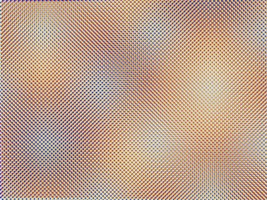
Carlos Cruz-Diaz - Couleur Additive

Carlos Cruz-Diaz – Couleur Additive

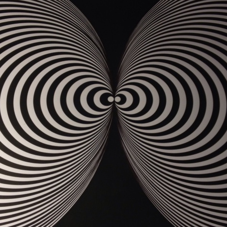
Marcel Duchamp

Marcel Duchamp

Entrance to the exhibition is free.  Hours are:

Monday – closed

Tuesday, Wednesday, Friday: 11 am — 4 pm

Thursday: 11 am — 9 pm

Saturday: 10 am — 4 pm

Sunday: Noon — 4 pm

Des Moines Art Center,

4700 Grand Avenue

Des Moines, IA 50312-2099

The Exhibition Press release is available here


Anomynous Artist

Anomynous Artist

Op Art started primarily in black and white.  Bridget Riley’s early pieces for example were painted solely in black and white.  Later she introduced shades of grey and later still a limited set of colours.  It’s nice to see the artist ‘Anomynous’ (sic) going back to the roots of Op Art and producing some excellent hand painted black and white pieces all created without the use of a computer.

Symmplicetry
Anomynous
63 X 51 cm
Ink and Acrylic
Paper
Symmplicetry Anomynous 63 X 51 cm Ink and Acrylic Paper
Free to Come, Free to Go
Anomynous
50 X 40 cm (approx.)
Ink and Acrylic
Paper
Free to Come, Free to Go Anomynous 50 X 40 cm (approx.) Ink and Acrylic Paper
Seed in Bloom
Anomynous
63 X 51 cm
Ink and acrylic
Paper
Seed in Bloom Anomynous 63 X 51 cm Ink and acrylic Paper

My work as the artist Anomynous is an experiment of the ideal versus the ego. Through my work I am seeking to communicate a language of proportion based on geometric principles that is not only accessible to the observer, but also challenges them to re-think their preconceived view of reality.

My pieces are designed to seed, grow and animate in the mind’s eye. They are formulas, they are simple principles that are universally familiar and they are reminders of our continued evolution, that this priceless journey of perception and understanding has not yet ended.

Phiral
Anomynous
58.3 X 43 cm
Mounting board (83.5 X 59)
Ink and acrylic
Paper
Phiral Anomynous 58.3 X 43 cm Mounting board (83.5 X 59) Ink and acrylic Paper
Swircle
Anomynous
63 X 51 cm
Ink and acrylic
Paper
Swircle Anomynous 63 X 51 cm Ink and acrylic Paper
Embryone
Anomynous
65 X 50 cm
Ink and acrylic
Paper
Embryone Anomynous 65 X 50 cm Ink and acrylic Paper

Did you study art? If so, where?

I have not had an institutional artistic education; what I know is what has captured my curiosity.

Why do you like Op Art in particular?

I like Op Art as I believe it is one of the few styles that allows for perceptive transgression; it has helped me unlock the way I see the world. What I really love about Op Art is that it is a language of proportions and understanding that language has been a key to my personal evolution as an artist.

Cosmic Sauna House
Anomynous
63 X 51 cm
Ink and acrylic
Paper
Cosmic Sauna House Anomynous 63 X 51 cm Ink and acrylic Paper
Symmevortices
Anomynous
49.5 X 41.5 cm
Ink and acrylic
Paper
Symmevortices Anomynous 49.5 X 41.5 cm Ink and acrylic Paper
Pentacycle
Anomynous
63 X 51 cm
Ink and acrylic/gouache
paper
Pentacycle Anomynous 63 X 51 cm Ink and acrylic/gouache paper

How do you make your art? / What’s the process for making one of your artworks?

I incubate concepts during my time at my non artistic day job, often sketching them out. Later that night I’ll work on handcrafting the concept into a large scale piece. This ‘artisan’ approach involves using a compass (remember those?!), pencils and ruler on paper. I then use ink liners to outline the piece. The final stage is applying acrylic and/or black gouache for the fills.

While it is obvious that digital technology has contributed much to the op art movement, I personally find there is little that can surpass that certain exhilaration of crafting a fully realised piece by hand.

Anonymous - work in progress
Anonymous – work in progress

I have a stage by stage photo method over at my blog for a more detailed review.

Any other art you like and other artists that inspire or have inspired you.

The biggest inspiration for my work is the laws of circle proportion and symmetry; these natural laws have entranced me in a continued deepening exploration.

As for artists, I am inspired by a diverse range of genres and mediums, I am drawn to anyone really who can manifest their emotions into the material world.

I have a heightened respect for masters such as Gaudi, whose work is simply transcendental.

1080 Degree Hyper Piston
Anomynous
59 X 41.7 cm
Ink
Paper
1080 Degree Hyper Piston Anomynous 59 X 41.7 cm Ink Paper
Zeus’ Gift
Anomynous
60 X 50 cm (approx.)
Graphite
Paper
Zeus’ Gift Anomynous 60 X 50 cm (approx.) Graphite Paper
Radials
Anomynous
63 X 51 cm
Ink
Paper
Radials Anomynous 63 X 51 cm Ink Paper

I would love to encourage anyone to learn the simplistic properties of a single radius for themselves and experiment with this boundless power source of raw, creative vibrancy.

You can see more of Anomynous’s work at his website.

Into the void @ University of Oklahoma Health Sciences Center

Into the void @ University of Oklahoma Health Sciences Center

UPDATE: This exhibition has been extended by popular demand. It has also now moved to the University of Oklahoma Health Sciences Center, 1000 Stanton L. Young Blvd, Oklahoma City, Oklahoma 73117 and will run until April 2014. Thanks to Theresa Hultberg for the information.

A fantastic new free-to-enter exhibition – “Into the void” – is being hosted by the Fred Jones Jr. Museum of art within the Oklahoma University Campus, in Oklahoma, USA.

The exhibition is ‘student curated’ (by students from the Oklahoma University School of Art and Art History) and features works from the Fred Jones Junior Museum of Art’s collection.  Artists on display include Bridget Riley, Victor Vasarely and Richard Anuskiewicz.

Titan C - Victor Vasarely

Titan C – Victor Vasarely

The exhibition opens to the public on the 9th February 2013 and runs through until the 28th July 2013.

You can find out more about the exhibition here

Fred Jones Jr. Museum of Art
555 Elm Avenue
Norman, OK 73019-3003

Monday:  Closed
Tuesday:  10 a.m. to 5 p.m.
Wednesday:  10 a.m. to 5 p.m.
Thursday:  10 a.m. to 5 p.m.
Friday:  10 a.m. to 9 p.m.
Saturday:  10 a.m. to 5 p.m.
Sunday:  1 p.m. to 5 p.m.

Entrance is FREE for everybody.

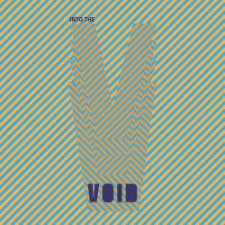
The exhibition features a great promotional logo design by Laura Fortner.

Into the void - Laura Fortner

Into the void – Laura Fortner

Op Art Tutorial – Victor Vasarely

Op Art Tutorial – Victor Vasarely

This is the first post in a series to help you create your own Op Art using some common software.  You’re going to need Photoshop for this one.

Today we’re going to make an Op Art work in the style of the great Victor Vasarely.

If you want to see some of Victor Vasarely’s work before we get started to understand his style a bit better then have a look in the Victor Vasarely Gallery.  If you want to read a Victor Vasarely biography to find out more about this great artist then please do!

vasarely-small

What’s important before we start is to work out how big we want the final image to be and how many ‘repetitions’ of the shape we want.  I’m going to create an image which is 1600 pixels by 1600 pixels and I’m going to have 40 ‘shapes’ going across and down the canvas.  So, let’s do the maths:

1600 picture / 40 shapes = 40 pixels per shape

NB – we’re using a ‘square’ shape and a ‘square’ canvas so this is for both dimensions.

First thing we’re going to do is create a pattern that we’re going to repeat over the canvas.  You can experiment with these but we’re going to use a single circle.  We’ve already worked out the size of our shape (40px by 40px) so create a new document of that size.

1-shape

If you’ve picked a small sized shape (like mine) press CTRL and the + sign a couple of times to zoom in (or ‘View’ -> ‘Zoom in’)

To make things a bit easier, I recommend using ‘guide’ lines so make sure under the ‘View’ menu you’ve got ‘Rulers’ and ‘Snap’ selected.  You can now drag a guide line by clicking on the ‘ruler’ at the top and dragging it down to the centre of the canvas we just created.  Do the same on the left hand side ruler.  If you aren’t sure what to do, click ‘View’ -> ‘New Guide’ and set the position to be half of the height of your shape and again for half of the width (e.g. here 20px vertical and 20px horizontal).

We’re now going to draw a circle the full size of this canvas.  Select the elliptical Marquee tool as shown below (NB – you can also see our ‘guide’ lines in place)

2-shape

Normally when you draw a circle in Photoshop you draw from one ‘corner’.  We want to draw from the centre outwards so to do this we’re going to move our cursor right to the middle of our canvas and hold ALT.  Then click and pull the circle selection out to the corner of the canvas.  When you get to the right point, Photoshop will highlight the edges of the canvas.  At this point, release the mouse and you have your circular selection.

We’re now going to fill that shape with a solid colour.  Select the ‘paint bucket’ tool by pressing G on the keyboard.  If it’s set on Gradient tool, right click on the tool icon in the LHS menu and change it to Paint Bucket Tool.  Click on the Set Foreground Colour icon on the LHS menu and set the colour to black.  Now move the cursor to the centre of the canvas and click to fill with our solid colour.  The fill is likely to be quite strongly anti-aliased so it’s worth clicking a few times (re-filling) in order to make it more ‘solid’.

Now we need to get rid of the selection, so choose ‘Select’ -> ‘Deselect’.

Finally we want to define this as a pattern, so choose ‘Edit’ -> ‘Define Pattern’.  Give it a name you’ll remember.

3-shape

Now we’ve got our pattern defined we’re going to create our actual artwork – create a new document.  I’m calling this one Vasarely and have sized it to 1600 by 1600 pixels. (File -> New)

Now pick a white foreground colour.  Fill the entire layer by pressing ALT + DELETE.

We’ve now got a single layer filled with white.

Now select ‘Layer’ -> ‘Layer style’ -> ‘Pattern overlay’

4-main

Click on the arrow next to the current pattern (1 above) and then click on the circle pattern we created earlier (2).  Press OK and the canvas will be filled with our circle pattern.

5-main-small

We now want to create a selection from our circles pattern overlay.  Click on the Channels bar (1 below) and then click on the ‘Load Channel as selection’ (2 below).  This will select our circles pattern.

6-main-cut

To colour the circles we’re now going to invert our selection.  ‘Select’ -> ‘Inverse’

To avoid having to repeat these steps when you’re experimenting with colours and gradients you can save this selection by choosing ‘Select’->’Save selection’ and giving it a meaningful name.  That means you can come back to it and try different things later.

Now we’re going to fill the circles with a solid colour (but equally we could use a gradient fill or whatever you want).

Choose a foreground colour and press G to get the paint bucket tool.  Click in the image to fill the circles.  I’ve used a very strong red here.  When you’ve filled the circles, you might notice that you can see the previous ‘black’ circles behind the coloured ones.  To deal with this, remove the pattern overlay from the layer below.  Drag the effects on Layer 1 (1)  into the recycle bin (2).  You should see the black edging disappear.

7-main-cut

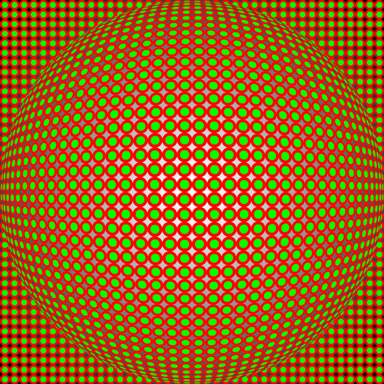
The next stage is to transform our circles pattern into an Op Art piece in the style of Victor Vasarely.  With our ‘circles’ layer selected click on ‘Filter’ -> ‘Distort’ -> ‘Spherize’.  I’ve put the Amount right over to 100%.

8-main

Click OK and there’s your basic Vasarely picture!

9-main-cut

You can experiment however you want.  Try creating different patterns, using gradients for the background and for the circles and so on.  This is just a basic tutorial to give you the idea – the rest is up to you.

vasarely-small

To create the picture above (for example) I created a similar pattern using the same size of ‘tile’ but made the circles smaller.  I added a layer containing these smaller circles to the original work and  filled them with a strongly contrasting green, applied the same effect (speherize) and moved that layer above the previous circles layer (since the shapes were smaller).  I also applied a radial gradient to the ‘background’ (previously white) layer.

In addition to colours and other layers, there are other interesting distortion filters in Photoshop that you could try messing around with.