Nikos Smyrnios

Nikos Smyrnios

Where Op Art meets Pop Art…  

Nikos Symrnios grew up in the 1960s – a time when Pop Art and Op Art were hugely popular both in the art world and in the mainstream.  These movements had a lasting and powerful effect on Nikos and he spent a lot of time trying to find a way to combine the two styles.  “Finally I succeeded in finding balance between them by developing an original visual style, the style I use today for creating my works”.  Nikos describes himself as the “Pop artist who is in love with Op Art.”  Nikos currently lives and works in Greece.

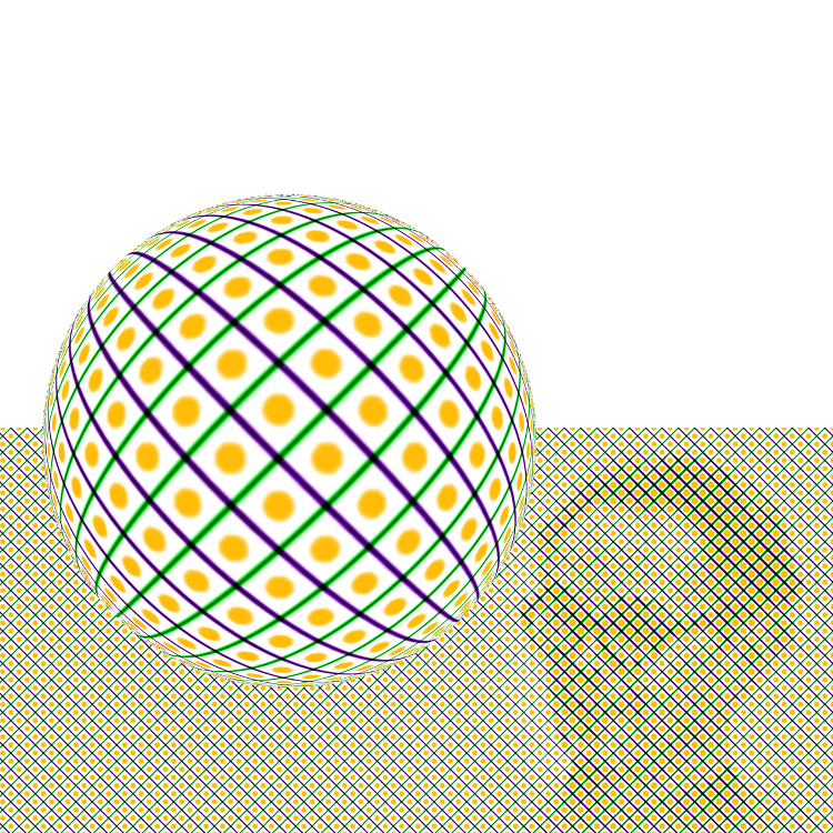
Vasarely Tribute
Nikos Smyrnios
Digital
2012
Vasarely Tribute Nikos Smyrnios Digital 2012
Landscape
Nikos Smyrnios
Landscape Nikos Smyrnios
Einstein Portrait
Nikos Smyrnios
Einstein Portrait Nikos Smyrnios

Did you study art?  If so where?

I studied at Stockholm’s College University of Art and Design (Konstfack), a school founded on the principles of Bauhaus and still considered the heart of Scandinavian Design. I graduated in 1981, after completing a five year program which was focused more on visual communication design and modern media (photography, video, graphics) than on matters of painting styles and traditional techniques.

How do you make your art?

I use mainly Adobe software (from Photoshop and Illustrator to After Effects and Flash), exploiting its creative possibilities to the maximum, by endless experimentation. The outcome of my art varies from traditional painting, to pen drawing and digital printing, so the technical process varies accordingly. In every case, the use of the computer is a matter of crucial importance, not only during the image generation process but also when trying to solve problems related to the final composition, the colors, etc.  My confident handling of formal techniques derives from my professional graphic design background.  As a graphic artist I am familiar with the laws of visual perception, which I use to create optical interest in my art.  By this means I approach the techniques of op art and try to match them to the philosophy of pop art.

Greta and Frankie
Nykos Smyrnios
Pen drawing on paper
35x50cm
Greta and Frankie Nykos Smyrnios Pen drawing on paper 35x50cm
Looking through a glass onion
Nikos Smyrnios
Mixed media on aluminium plate
51 x 78cm
Looking through a glass onion Nikos Smyrnios Mixed media on aluminium plate 51 x 78cm
Op Marilyn
Nikos Smyrnios
Oil and acrylic on canvas
65cm x 65cm
Op Marilyn Nikos Smyrnios Oil and acrylic on canvas 65cm x 65cm

What’s the process for making one of your artworks?

Like other pop artists, I express my view of the times above all through the use of the portrait. Anyone can become my model, but I have mostly chosen to portray idols of a glorious era, mainly rock and film stars or other famous people, who later became icons and symbols of ideals within the global ethical and cultural tradition. In other words, photo manipulation, by the use of different methods, is an important part of this process. I try though to avoid making sterile, mechanical reproductions of the photo (or the photos) that I use as a reference for portraying a person, paying attention to the sensitive matters of copyright, about which I am quite conscious. For this reason, I often use more pictures of the same person as reference, for creating a “new” one and finally I put the portrait in a conceptual context according to the portrayed personality. This is the most essential part of the process. I use my experience from the graphic design world to produce poster like works, following the pop art tradition, (as pop art is closer to the graphic arts than any other art movement). The use of applied design gives my images their character, while these images usually reflect my own views. The last step of the process is transferring the image onto a canvas, or a piece of paper, cardboard, a metallic plate etc. Depending on the material and the painting medium I use conventional transferring methods, overhead projections or prints.

Singing for Love
Nikos Smyrnios
Singing for Love Nikos Smyrnios
Desert Illusion
Nikos Smyrnios
Mixed media on aluminium plate
78x51cm
Desert Illusion Nikos Smyrnios Mixed media on aluminium plate 78x51cm
Op Acrobat
Nikos Smyrnios
Mixed media on aluminium plate
51x78cm
Op Acrobat Nikos Smyrnios Mixed media on aluminium plate 51x78cm

Why do you like Op Art?

Op Art has several aspects. Whichever of these aspects you experience you can’t help but like it. First and foremost, Op compositions are full of power able to energize even the most indifferent viewer. They bring the senses of two and three dimensional states into one vibrant unity. Besides, the positive and negative spaces are of equal importance more in Op art compositions than in other kinds of art.

Their geometric character is another aspect that I love. Geometry has intrigued me already from the time I was an art student and created my first experimental paintings/installations, depicting various geometric theorems and philosophical principles of the main Greek mathematicians and philosophers. (The “Pythagorean I” is the most important work of this series). Last but not least, by studying Op art’s non-representational nature I found I could comprehend and appreciate the great values of abstract art.

Stars and Stripes
Nikos Smyrnios
Acrylic on aluminium plate
34x45cm
Stars and Stripes Nikos Smyrnios Acrylic on aluminium plate 34x45cm
Glimpses of Angelina
Nikos Smyrnios
Mixed media on aluminium plate
39x51cm
Glimpses of Angelina Nikos Smyrnios Mixed media on aluminium plate 39x51cm
Gagarin
Nikos Smyrnios
Oil on aliminium
78x51cm
Gagarin Nikos Smyrnios Oil on aliminium 78x51cm

Other art and artists that you like or have found inspirational?

I like almost every kind of art when it’s pure and genuine.

As for other artists that have inspired me there are quite a few! I would like in particular to mention Juan Miro, Frank Stella, Peter Blake, Roy Lichtenstein, Victor Vasarely, Renato Guttuso and Equipo Cronica (Manolo Valdes and Rafael Solbes).

You can find out more about Nikos and see more of his work on his facebook page.

Nature looks at you - Nikos Smyrnios
Nature looks at you – Nikos Smyrnios

Bridget Riley wins Sikkens Prize

Bridget Riley wins Sikkens Prize

Bridget Riley has made history again, this time by becoming the first woman to win the prestigious Sikkens Prize.  The Sikkens Prize is a Dutch art award given to an artist in recognition of their ‘use of colour’.

From the Sikkens Foundation website: “This grand old lady of British art will receive this prestigious colour prize for the way in which she has enriched her work with colour. The purity, subtlety and precision of her use of colour have led to a sensational oeuvre from which a new generation of artists is drawing inspiration. At the same time she has demonstrated her ability to appeal to a broad public with her abstract work.”

The Gemeentemuseum Den Haag is putting on a Bridget Riley exhibition in honour of her win which runs until 01/06/2013

Ramiro’s Ghost

Ramiro’s Ghost

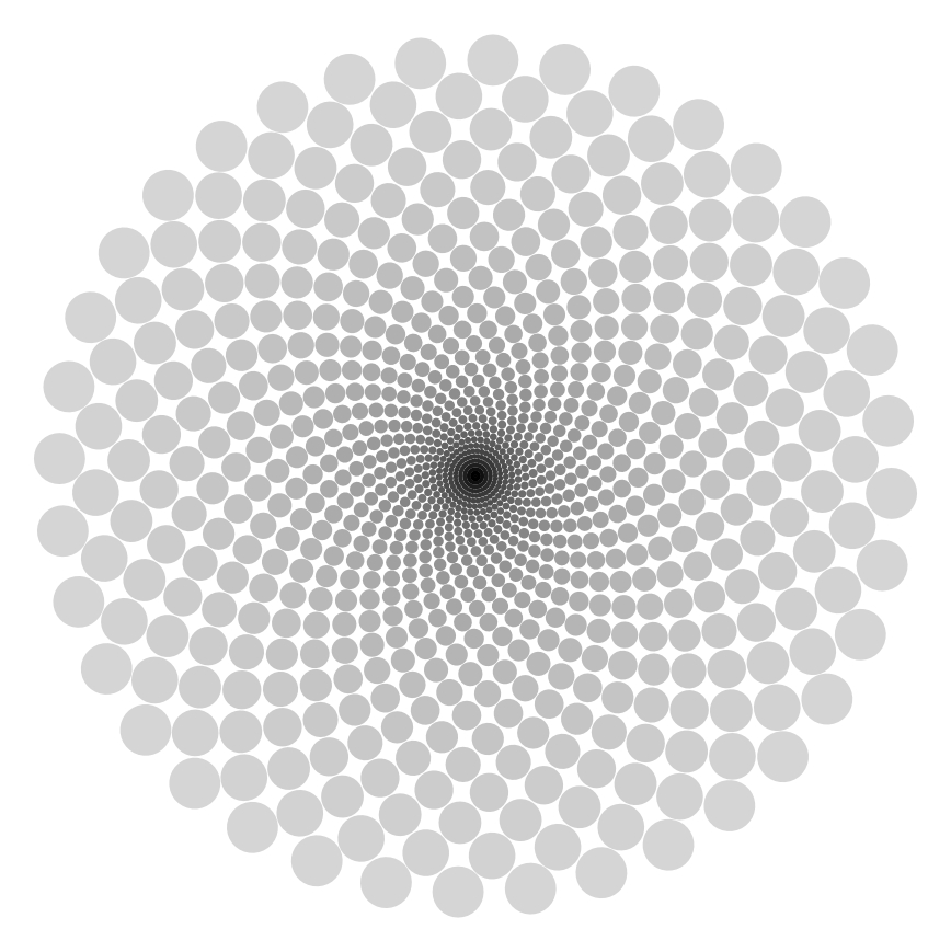
Every now and again you encounter a piece of Op Art that produces such a strong visual effect it serves to remind you how much there still is to learn about human perception.

“Ghost” (above) by Mexican artist Ramiro Chávez Tovar is one such piece.  As you look towards the centre of the piece you’ll fleetingly notice that there appear to be a series of grid-like concentric circles and straight lines running from the outer edges into the centre.  Move your eyes or concentrate on a small section of the image and you’ll see that these lines are not part of the picture – it is in fact your perceptual system that is creating them.

You can see more of Ramiro’s work, including ‘Rotating drops’ above, on his deviant art profile.

For those who are interested, Ghost was created in contextfree and was generated by the following code:

startshape ghost

background {b 1}

rule ghost {

36*{r -10 h 10 }{30*{y 0.99 s 1.099 r 5.5 h 10 b 0.06} CIRCLE {y 1}}

CIRCLE {s 1}

}

Thanks to Ramiro for getting in touch with me.

Jaka Bonča

Jaka Bonča

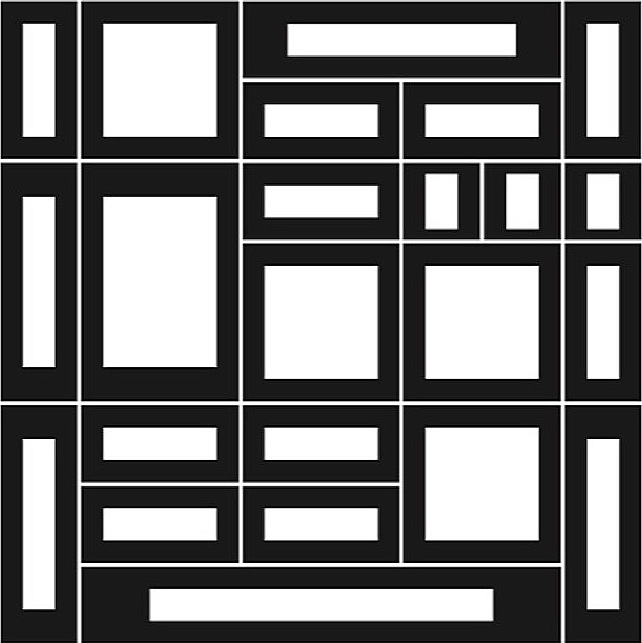
One of the things I like about running this site is finding people who create Op Art in a totally original and unique way – for example Orang Vahid who produces stunning Op Art pieces using only the ‘draw’ utility within Microsoft Word.  Jaka Bonča fits this category of artists; all of his art is created using fonts that he has created himself.  Jaka calls it ‘Fine Art Typesetting’ and his art ‘Modular Ornamental Typography’.

XC
Jaka Bonča
Rapidograph on paper
XC Jaka Bonča Rapidograph on paper
Mon 1
Jaka Bonča
Font: Signs
Mon 1 Jaka Bonča Font: Signs
3612 a1
Jaka Bonča
Font: Signs
3612 a1 Jaka Bonča Font: Signs

Did you study art? If so, where?
I was originally trained as an architect. I have a Bachelors degree, Masters (of Science) and PhD in architecture from the University of Ljubljana in Slovenia.  At present I am very much involved in the ‘theory of art’ and am teaching Presentational Techniques, Theory of Art and Design Concepts at the University of Ljubljana.

Why do you like Op Art?
Op Art is clean. The visual elements are there as elements in themselves without taking on any meaning from literature or music or similar. My preference within Op Art is for flat images with as little illusion of the third dimension as possible.

1-3
Jaka Bonča
Font: Hatchings
1-3 Jaka Bonča Font: Hatchings
Broken Space-B-1
Jaka Bonča
Font: Hatchings
Broken Space-B-1 Jaka Bonča Font: Hatchings
Elastic Space-A-1-1
Jaka Bonča
Font: Hatchings
Elastic Space-A-1-1 Jaka Bonča Font: Hatchings

How do you make your art?
I started making geometrical drawings long before PCs were common and something that everybody had.  I was always very interested in computers but they were not accessible, so instead I tried to think like a computer myself. Initially I drew all my drawings by hand with a rapidograph and a ruler. I wanted a computer-generated or computer-processed drawing, but since I didn’t have a computer, like I said, I began to think like a computer instead. This way of thinking does not allow for visual corrections. Consequently, the relationships between the elements in the drawing are exactly the way they are. They are not concealed, which is achieved subconsciously when drawing by hand.  At a later point in time, when the opportunity arose, I started using computers.  In retrospect, I added text that speaks about my thoughts triggered by the drawings. But this is only a small proportion of all my thoughts. I designed linear drawings without any illusion of the third dimension. Nevertheless, every composition could be translated into sculpture.

Rototype-3-Dotted-2
Jaka Bonča
Font: Signs
Rototype-3-Dotted-2 Jaka Bonča Font: Signs
Ulm 13 1
Jaka Bonča
Font: Signs
Ulm 13 1 Jaka Bonča Font: Signs
Sudoku 9x9-15
Jaka Bonča
Font: Sudoku 5
Sudoku 9×9-15 Jaka Bonča Font: Sudoku 5

What’s the process for making one of your artworks?
I make a font first.  This is a predicted set of basic shapes with predefined spaces in-between – kerning and leading. Each shape is assigned to a key on a keyboard. Fonts are mostly monospace – all the elements are of the same width.  I started with Fontographer, cross-graded to Fontlab and lately I have started working with Glyphs.  What follows is »typesetting«.  I type text like I am typing a mathematical formula: »letters« with superscript (exponents) and subscript. In the last few years I have started using a pre-typed text too and solved Sudokus (Japanese crossword puzzles) – you can see more of this on my website.  For typesetting I was initially using Quark X Press but have recently started working with InDesign.

Any other art you like and other artists that inspire or have inspired you.
I prefer abstract, non-representational art, typography and modern music from Iannis Xenakis – with his mathematical approach using Markov Sequences.

2000
Jaka Bonča
Font: Modular
2000 Jaka Bonča Font: Modular
Square 87
Jaka Bonča
Font: Signs
Square 87 Jaka Bonča Font: Signs
k2infi-mm-1
Jaka Bonča
Font: Signs
k2infi-mm-1 Jaka Bonča Font: Signs

Anything else you like doing, anything else you want to say generally?
I am interested in »primary« knowledge – mathematics. I find that very inspiring. Not the visual representation of mathematics but the way it is used to solve problems. Basically there were two teachers who influenced me most. The first was the painter Drago Hrvacki.  I attended courses he ran from childhood and met him later whilst studying at the university. The second was the mathematician Josip Globevnik, my professor at the university.

You can find out more about Jaka’s work on his fascinating website: www.rototype.org

Alberto Biasi @ Maab, Padova, Italy

Alberto Biasi @ Maab, Padova, Italy

Maab Studio d`Arte are currently running an exhibition of the works of first-generation Op Artist Alberto Biasi.

Politipo - Alberto Biasi - 1972 - 60cm x 60cm

Politipo – Alberto Biasi – 1972 – 60cm x 60cm

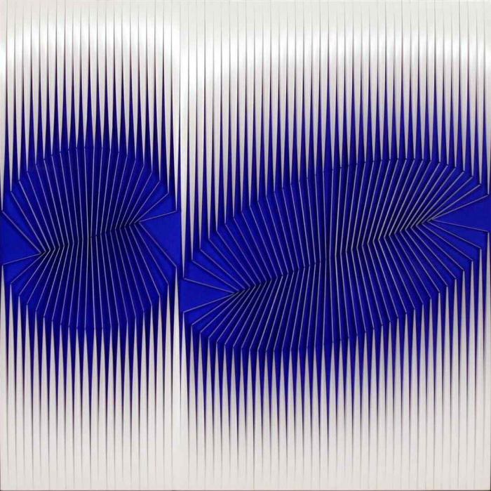
The exhibition is comprised of works from his ‘Polytypes’ series.  Given that most of the works come from private collections it was no mean feat to collect together the works for the exhibition.

The Polytypes series was started in the 1960s and was a series that Biasi revisited in the 1970s, 1980s, 1990s and 2000s.  With each visit, the series changed an became increasingly articulated, but the essential characteristic remains which is the creation of the perception of movement created by the subtle movements of the observer.

Insieme - Alberto Biasi - 1991 - 80x75cm

Insieme – Alberto Biasi – 1991 – 80x75cm

Alberto Biasi featured recently in shows such as “Italian Zero & Avangarde ’60s” at the Museum Multimedia Art in Moscow and in Rome at the National Gallery of Modern Art in the exhibition “Art Kinetic and Programmed by Munari, Biasi, Colombo…”

Un Insieme Geometrico - Alberto Biasi - 2010 - 78x74cm

Un Insieme Geometrico – Alberto Biasi – 2010 – 78x74cm

The exhibition is on from October 13, 2012 to November 16, 2012.

Maab: Riviera San Benedetto 15, 35141 Padova, Italy

Entrance is free.  Wednesday to Saturday from 16.30 to 19.30 or by appointment.


You can see some more of Alberto Biasi in the Op Art Gallery