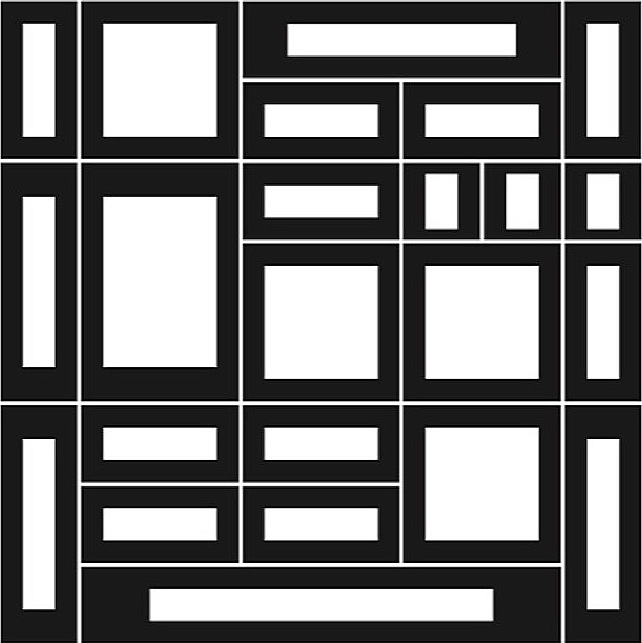
One of the things I like about running this site is finding people who create Op Art in a totally original and unique way – for example Orang Vahid who produces stunning Op Art pieces using only the ‘draw’ utility within Microsoft Word. Jaka Bonča fits this category of artists; all of his art is created using fonts that he has created himself. Jaka calls it ‘Fine Art Typesetting’ and his art ‘Modular Ornamental Typography’.


Did you study art? If so, where?
I was originally trained as an architect. I have a Bachelors degree, Masters (of Science) and PhD in architecture from the University of Ljubljana in Slovenia. At present I am very much involved in the ‘theory of art’ and am teaching Presentational Techniques, Theory of Art and Design Concepts at the University of Ljubljana.
Why do you like Op Art?
Op Art is clean. The visual elements are there as elements in themselves without taking on any meaning from literature or music or similar. My preference within Op Art is for flat images with as little illusion of the third dimension as possible.


How do you make your art?
I started making geometrical drawings long before PCs were common and something that everybody had. I was always very interested in computers but they were not accessible, so instead I tried to think like a computer myself. Initially I drew all my drawings by hand with a rapidograph and a ruler. I wanted a computer-generated or computer-processed drawing, but since I didn’t have a computer, like I said, I began to think like a computer instead. This way of thinking does not allow for visual corrections. Consequently, the relationships between the elements in the drawing are exactly the way they are. They are not concealed, which is achieved subconsciously when drawing by hand. At a later point in time, when the opportunity arose, I started using computers. In retrospect, I added text that speaks about my thoughts triggered by the drawings. But this is only a small proportion of all my thoughts. I designed linear drawings without any illusion of the third dimension. Nevertheless, every composition could be translated into sculpture.


What’s the process for making one of your artworks?
I make a font first. This is a predicted set of basic shapes with predefined spaces in-between – kerning and leading. Each shape is assigned to a key on a keyboard. Fonts are mostly monospace – all the elements are of the same width. I started with Fontographer, cross-graded to Fontlab and lately I have started working with Glyphs. What follows is »typesetting«. I type text like I am typing a mathematical formula: »letters« with superscript (exponents) and subscript. In the last few years I have started using a pre-typed text too and solved Sudokus (Japanese crossword puzzles) – you can see more of this on my website. For typesetting I was initially using Quark X Press but have recently started working with InDesign.
Any other art you like and other artists that inspire or have inspired you.
I prefer abstract, non-representational art, typography and modern music from Iannis Xenakis – with his mathematical approach using Markov Sequences.


Anything else you like doing, anything else you want to say generally?
I am interested in »primary« knowledge – mathematics. I find that very inspiring. Not the visual representation of mathematics but the way it is used to solve problems. Basically there were two teachers who influenced me most. The first was the painter Drago Hrvacki. I attended courses he ran from childhood and met him later whilst studying at the university. The second was the mathematician Josip Globevnik, my professor at the university.
You can find out more about Jaka’s work on his fascinating website: www.rototype.org

